Books in print
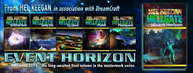
HELLGATE series
NARC series
Vampyre series
Science Fiction
Fantasy
Historicals
Sea stories
Shorter works
Freebies
Shop
Gallery
What's new?
What's due?
Caveat
All titles on this website feature GLBT characters and situations.
If you will be offended, please read no further. By further
exploring this site, you agree that you are of age in your
part of the world, and are fully aware of the content of books
and art displayed here.
All images on this site are copyright.
Site contents © DreamCraft, 2018
|
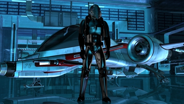
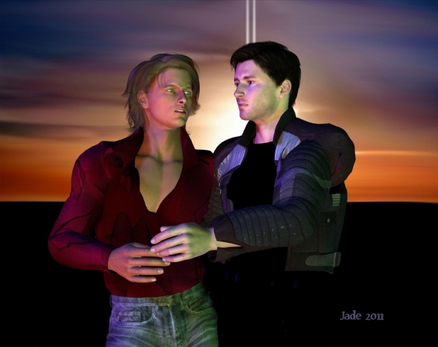
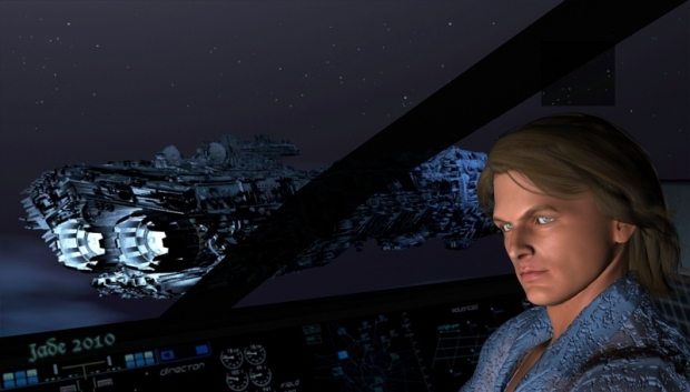
All images on this website are by Jade, and were produced to illustrate -- often for covers -- the works of Mel Keegan. Characters were designed in cooperation with
Mel, to realize some of the more iconic heroes of novels which now span a couple of decades! Jade has a gallery page onsite here -- click here, and enjoy!
THE NARC GALLERY lives onsite here. THE HELLGATE GALLERY lives offsite, on Jade's
"Welcome to My Worlds
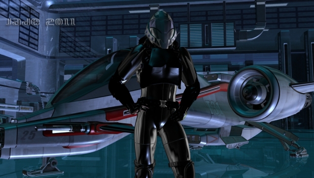
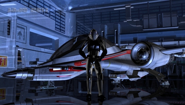
Captains Jarrat and Stone, the Blue Ravens, Cronin and Ramos ... Capt. Gene Cantrell and Colonel Dupre, Harry Del, Yvette McKinnen and Eve Lang, Curt Gable and Mischa Petrov ...
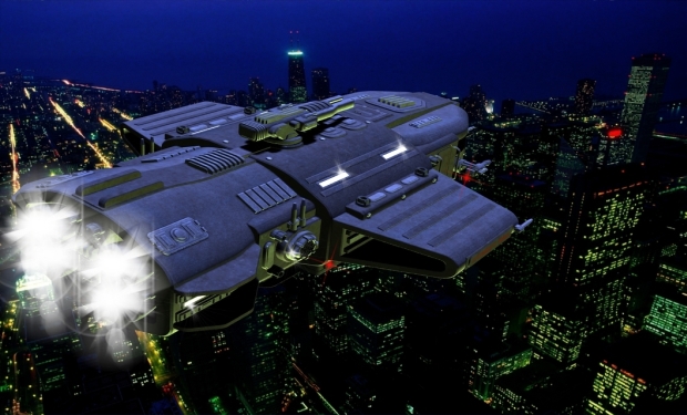
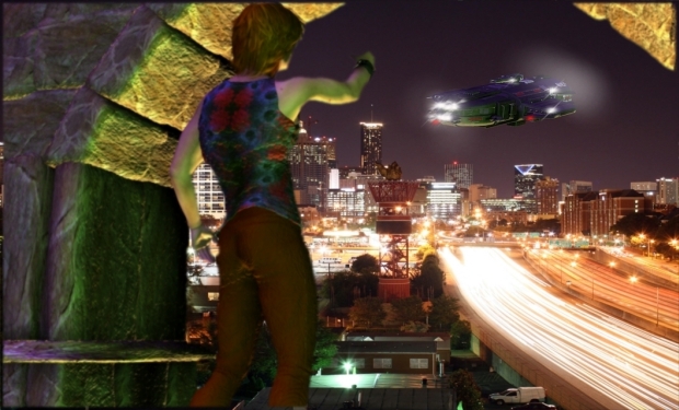
NARC 101, NARC Air Park in the city of Venice, the NARC riot armor, the Blue Raven gunship, the city of Elysium, and a whole lot more!
NARC Page One | NARC Page Two | NARC Page 3 | NARC page 4 | NARC page 5


NARC Page One |NARC Page Two | NARC Page 3 | NARC page 4 | NARC page 5
|
|
|